Subscriber Benefit
As a subscriber you can listen to articles at work, in the car, or while you work out. Subscribe NowThe fomenters of fermentation at Upland Brewing Co. figure they’ve produced more than 100 distinct potions since 1998.
Most were hits; others perhaps were best used to dissolve stubborn stains from a coffee mug. But inasmuch as yeast culture makes for beer, creativity is the basis of Upland’s fun-loving corporate vibe.
After all, said President Doug Dayhoff, “We’re brewers, not cardiologists.”
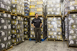 Upland Brewing Co. President Doug Dayhoff dwarfed by older cartons. New versions on left. (IBJ photo/Aaron P. Bernstein)
But the creative charm reflected in its bottle labels and beer cartons started growing stale over the years. So Upland recently hired Indianapolis ad agency Young & Laramore to help, as Dayhoff puts it, “organize our thoughts” in a rebranding of sorts. The project provides a rare peek into the psychology of designing labels of alcoholic beverages.
How a label or carton looks is more important than ever as store shelves sport a dizzying number of brands—many from independent breweries springing up like wildflowers. Craft brewers in the United States now account for about 8 percent of beer by volume, and sales last year rose 20 percent, to over $14 billion.
Assuming one became a fan of Upland’s beers, however, it could be difficult to pick out which case on the store shelf was a product of Dayhoff’s merry alchemists at the 140-employee company.
Some of its brands, sold in the Midwest, wore the Upland logo prominently; others did not. Sometimes the corporate logo was on the left, sometimes it was on the right. Stylistically, as well, Upland’s packaging was all over the map.
Some brews, such as the Nut Hugger Brown Ale, featured a photo—of a squirrel, of course. Others, like the Dragon Fly Ale, sported an illustration that looked more like what’s smashed on one’s windshield on a summer’s day. And its wheat ale sported a picture of a wheat field under an eerie glow, like something out of Middle Earth in Lord of the Rings.
“It was an opportunity to start over from scratch,” Dayhoff said.
‘Place’ sells beer
So Young & Laramore did its usual focus on gathering feedback from consumers about the beer brand. One thing that became clear is that “people tend to buy a beer they associate with a place,” said Bryan Judkins, a Young & Laramore principal who headed the project for Bloomington-based Upland.
Coors, for example, reminds one of the Rocky Mountains. Brews from Sierra Nevada Brewing Co. remind one of the Sierra Nevada Mountains.
Ah, but Upland … reminds one of Bloomington, the Brown County foothills and the Mitchell Plain, Judkins said. “We had a hunch about this place in southern Indiana, where the glaciers stopped.”
Hoosiers in this part of the state identify with the outdoors—with quarry jumping, camping and such.
So some of the redesign played up these themes more prominently. Take Upland’s Campside ale. The old label showed a campfire in the distance, under a canopy of glowing tree limbs that seem to be spinning as if one had just downed an entire six-pack.
The new design shows a hand drawing of a campfire, on whose flames are drawn the phrase, “Brewed to leave no trace.”
A universal theme to the labeling makeover was the use of hand-drawn illustrations and lettering. Young & Laramore hired Bordeaux, France-based Bruno Michaud, whose BMD Design has done hand-drawn work for such notable clients as Nike and Levi Strauss & Co.
Labels hand-drawn in France
 At first, Dayhoff was skeptical someone from a country that says oui-oui to wine would have a feel for a craft beer culture. But Michaud “nailed it,” he said.
“We do hand-crafted beer. I think that idea of the art and the illustrations and the lettering style that’s all completely hand-drawn—that artistically is the unifying element, there.”
Even though one may not associate southern Indiana as the summer home to Greek sun god Helios, Michaud’s illustration of Helios’ flaming chariot on the six-pack carton radiates of the hand-drawn, hand-crafted theme.
To reinforce that image, the phrase “Bloomington Indiana Midwest USA” runs across the bottom of the carton.
The Hoosier theme continues in brews such as “Bad Elmer’s Porter,” which has a hand-drawn image of a hat-wearing, bearded man who could pass for a southern Indiana ridge-dweller.
Elmer (a tribute to a guy who lived near the brewery) has a mesmerizing poker face, which generates evocative thoughts as to what’s on Elmer’s mind. Is he about to offer you a slab of beef jerky? Or perhaps Elmer is thinking, “You flirt with cousin Jolene and I’ll be fixin’ to kill you dead!”
The previous design, in contrast, had a photo of the man said to be Elmer himself and hardly stands out.
Manifestos and more
In fact, Young & Laramore and Upland employees set up a shelf full of beers from Upland and competitors to simulate what might go through consumers’ minds and get their attention.
To add more curb appeal, the newly designed packages also have manifestos (Dayhoff calls them “manifestitos”) with clever sayings that add to the folksy, creative, hand-crafted image.
“Beers have personalities. Breweries have personalities,” Dayhoff said.
And the freshened corporate logo now resides consistently at the top center of each carton and label.
Even beer cases were redesigned, so that, when they’re stacked on the display floor, the hills all line up to create a big mural of sorts of Bloomington’s rolling hills.
To reinforce the down-home theme, Young & Laramore designed new handles for installation on beer taps. They’re shaped like a wooden ax handle.
Working with the brewery was a bit different for Young & Laramore, whose clients have included corporate customers such as Delta Faucet, Schlage and Scotts Lawn Service.
Besides working for a beer company, Y&L got an earful from Upland’s creative-minded staff as part of the package redesign. Judkins said it was important to accurately reflect the brewery’s existing culture.
“We said [to the ad agency], ‘Help us get our thoughts organized rather than substitute our thoughts for yours,’” Dayhoff said. “We had a much stronger opinion of how things should look than many of their other clients.”
Of course, there was an upside to working with the brewery, Judkins said.
“We had the privilege of tasting. There was no shortage of beer around.”•
Please enable JavaScript to view this content.